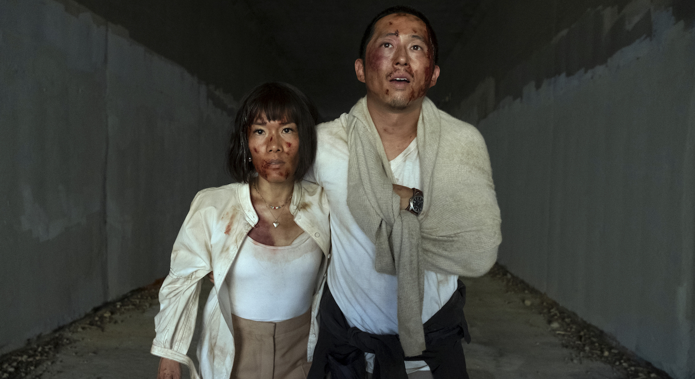
The dark comedy unravels through ten episodes and asks the question: How far are you willing to go to ruin the life of a complete stranger? For Danny and Amy, there are no limits. In conjuring the visual style of the Netflix show, Yun was inspired by the duality of characters, drawing from their inner struggles and public personalities, a motif costume designer Helen Huang pulled from as well.
Below, Yun shares how each of their character attributes played into designing the homes of Danny and Amy.
The material of Beef is deliciously chaotic yet also beautiful in its own way. Was there anything you and Sonny referenced in terms of creating the overall visual style?
Sonny sent me his “holy grail” formula: Thirty-five percent Sopranos/Paul Thomas Anderson flawed character comedy, plus thirty-five percent Netflix binge-ability/White Lotus water cooler moments, plus thirty percent Ingmar Bergman/Hirokazu Koreeda warm melancholic pathos.
Fantastic.
I thought it was highly ambitious but wanted to help go for it! Visually, we wanted to ground the story in a world that felt real and believable but with moments that veered surreal as the narrative progressed. It was also important for the world to feel like Los Angeles. We shot the majority of the show in LA locations, but Danny’s apartment and Amy’s house were stage builds. Cinematographer Larkin Seiple and I worked together to create a parched, sunbaked color palette to reference the unrelenting Los Angeles sun.
Was there anything else you and Larkin Seiple discussed to guide the visual style?
Beyond our sun-baked look, we talked pretty much every day about upcoming scenes, especially if we were planning to do something extra for a tonal shift. Episode ten was a fun experience, it was the last week of shooting almost all exteriors in a park, and the challenge was to hide all the walking paths and signage with overgrown greens at a moment’s notice. We had to work closely together to create those compositions that hopefully don’t read like a public park.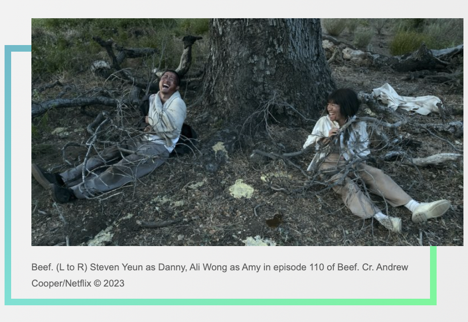
Amy’s home has a Le Corbusier vibe to it. Modern, bespoke with a monochrome palette. Was there a driving force behind its look that connected it to her character?
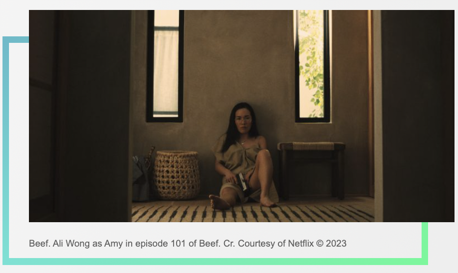
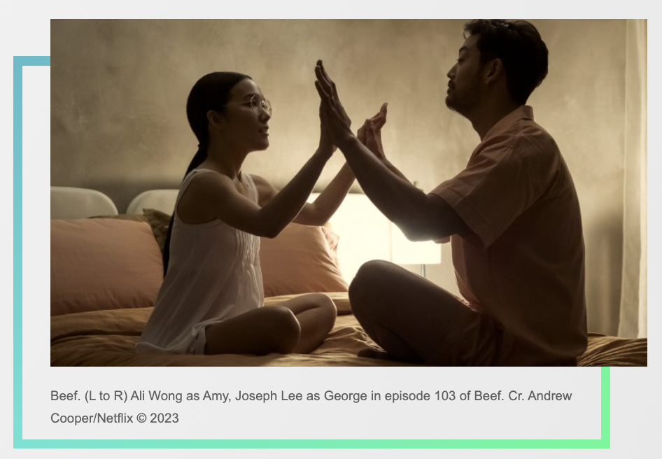
Sonny described Amy as someone who works incredibly hard for her ambitions but at the cost of being honestly herself. So we wanted her home to represent the great effort she puts into her presentational side, yet still have the darker mood of her inner self. Her curated aesthetic needed to touch almost every element in her home and Koyohaus [her business]. We talked about her house being a cage of her own making, so we leaned into that motif with the floor plan, wood slats, and concrete-colored walls. Another important feature was restricting views of the sky.
On the flip side, Amy’s workplace has its unique feel. How did you want to separate her business from her home life through design?
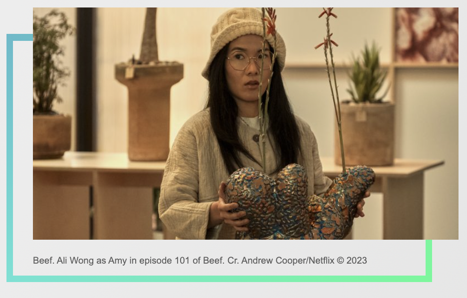
Koyohaus is all about Amy being successful in business, so we wanted it to feel brighter and more vibrant than her home space. The light wood motif is there but in a grid wall pattern with pink desert images on a white wall backdrop. The design approached Koyohaus as Amy’s version of a gallery space for plants. She’s drawing from the trend of taking care of plants as if they are beloved pets. The setup she has is trying to sell a millennial minimalist bespoke lifestyle; each plant is like a unique sculpture in a wabi-sabi pot of the client’s choosing (within 4 colors and 4 shapes). Accessories like hand-woven brooms and blown glass bottles with plant nutrient elixirs add to the aesthetic lifestyle branding.
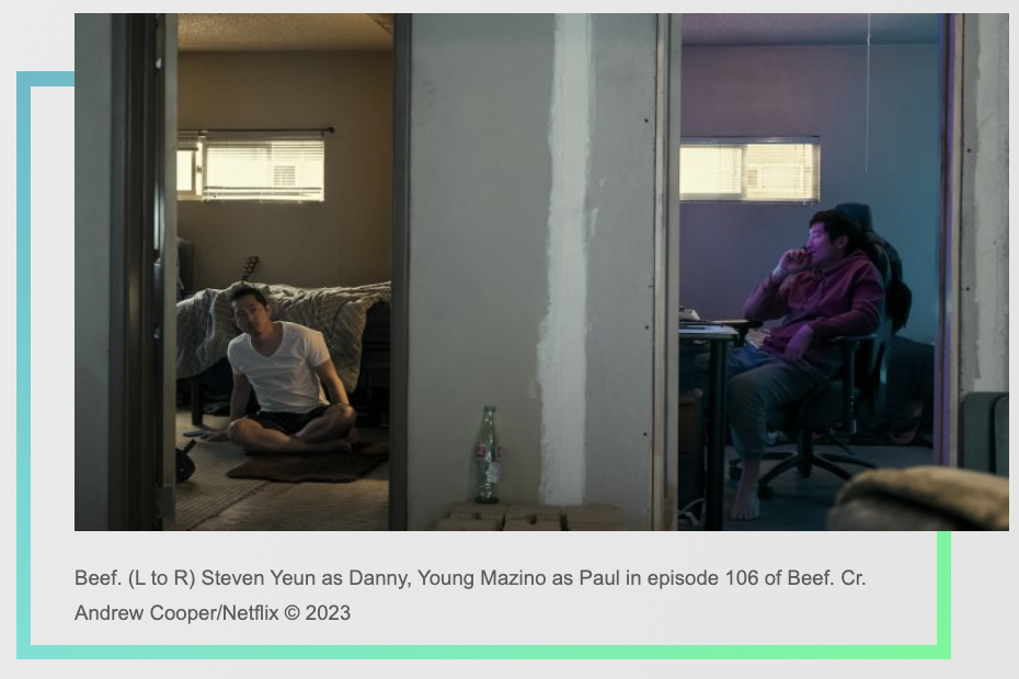
Danny’s apartment he shares with his brother Paul (Young Mazino) has such a stripped-down, lived-in vibe. Did Sonny have any specific thoughts about the appearance?
Sonny reminisced that Danny’s apartment felt like his first apartment in Los Angeles, and that became the early inspiration. From here, there were many layers we wanted to convey in terms of mood and lifestyle. We wanted the apartment to look like Danny’s DIY attempt to convert the space into a two-bedroom but with an unfinished look to represent his lack of motivation to complete his goals. Other layers hope to show his resourceful mentality of saving construction supplies, sentimentality like the Korean folding table and older mismatched furniture that give it a collected, frugal feel. It’s been a while since he had enough to spend on new furnishings.
When establishing the look of a television series versus a film, are there different things you have to consider from the start?
Mostly it’s in how we prep. TV is usually a much shorter prep time, juggling many episode timelines in one shooting block, and often we don’t have all the scripts written. So you have to stay adaptable and ready to pivot at any moment. Creatively, I find having strong themes and concepts that carry through the entire season is helpful to keep the look in bounds.
This article was first published on The Credits