
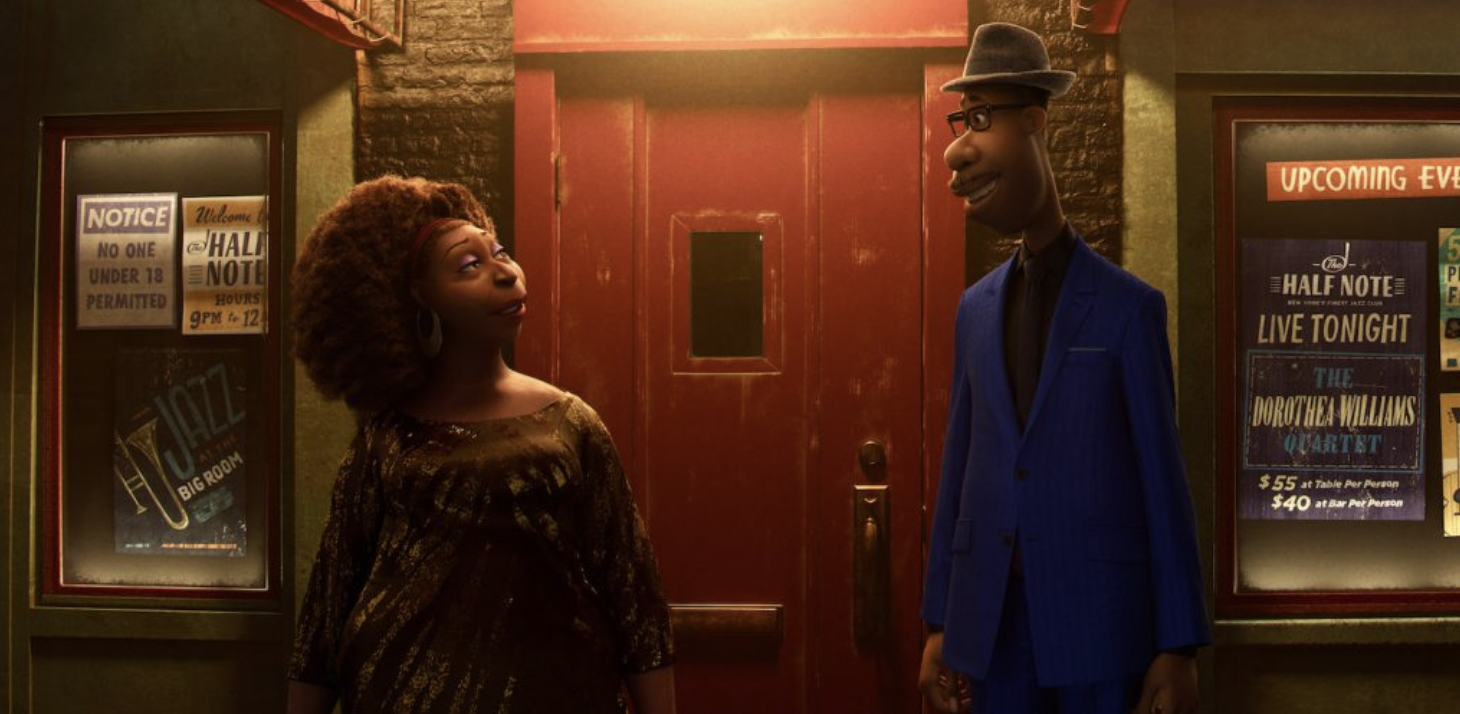
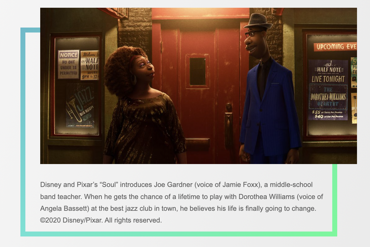
Once again Pixar tackles the subjects of the meaning of life, fearlessness in the face of change, synchronicity, and inspiration in their new film Soul. It’s the first time, however, that they have centered the story on a Black man, that of middle school band teacher and jazz pianist Joe Gardner (voiced by Jamie Foxx). Daniel Lopez Muñoz has worked in such diverse roles for Pixar as a character designer for Up and Coco, color script artist for Finding Dory, production designer for The Good Dinosaur, and visual development artist for Monsters University. On Soul, he is credited as the character art director. The Credits spoke to Muñoz about how he influences the look and style of the lead character in Pixar’s most ambitious film to date.
On IMDB you are listed as character art director for Soul. Titles can mean different things at Pixar. What did your job entail?
It does tend to differ from production to production. To give you a little bit of history on my participation on Soul, the film had a core team, and I came on through the request of Pete Docter to try to find Joe Gardner, the main character of the film. There are a number of artists that came in early on in the process to try to get different perspectives for the look of the character.
Can you point to several aspects of Joe’s character that you had a hand in?
Early on, we tried different approaches. At one time he was a shorter, stockier guy. We spent a lot of time looking at jazz artists from the mid-twentieth century, to try to grasp some inspiration of a personality from famous jazz musicians like Monk, for example. We tried that, but what succeeded was when we turned to something more familiar. There was something about Pete Docter’s persona that attracted me to a taller, loose, lanky body. I thought Pete must have gone through life trying to fit into places because he’s so tall, but also seeing so much. Joe is a guy who is thinking of what’s on the horizon, what’s beyond the life that he has currently because he wants to reach further. So we thought it would be cool if he towered over people, and had his heads in the clouds most of the time when thinking about what his life could be. But also it would be fun for a character like 22 to inhabit this body that has to maneuver through a crowded city like New York. We didn’t want him to be a handsome man, we wanted him to feel more like an everyday Joe, hence the name. He had to have some imperfections that would make overcoming them that much more interesting. We imagined him having been the awkward kid, trying to play with the cool kids. We gave him a long back and a belly. He’s middle-aged. He’s almost past his prime, and he’s trying to make it in the jazz world, so that has to be apparent from the moment you first see the character, and that’s something we wanted to make sure the audience understands right away.
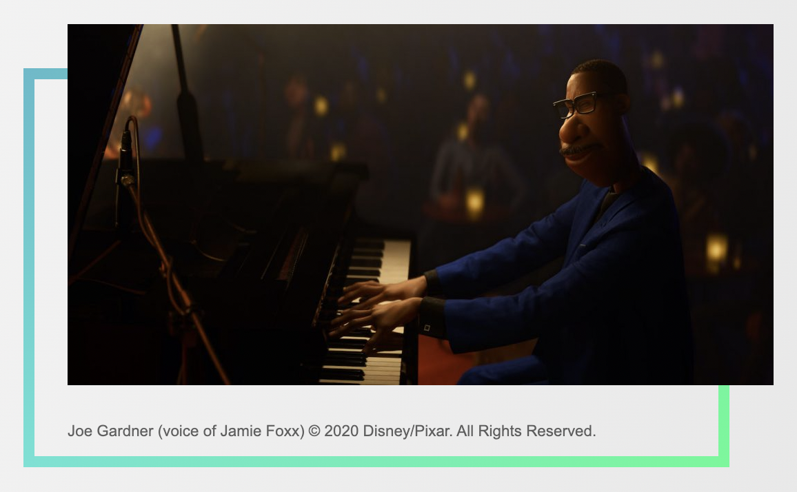
He really has a jazz pianist’s fingers. There had to be conversation and consideration around that.
Oh yes, that was actually very important, because these hands were going to be onscreen in close-up. Basically, it’s the working tool of this artist, so it was important to give them enough character that they could be on the big screen. More important for us is they would also feel like the hands of a true African-American pianist. We looked at and studied nearly every famous jazz musician, and studied the way the fingernails are different. We wanted to make sure we were true to the way Joe should be, including the length of his fingers. There were a number of pianists we studied, and we put up their pictures for reference, both contemporary and from the past. Then we did a lot of drawings to guide the animators.
There is such a wide variety of Black and Brown skin represented in the characters of Soul. How did you support and help foster that?
We were very keen on representing a wide variety of skin tones and of people and mixes of people of color, because in New York you have the folks that immigrated from the North and the South, and started a whole Harlem Renaissance from the great migration, but there are also lots of people that came from the Caribbean, and there are lots of Latin influences as well, so that gives you a really great range of skin tones. For Joe, I wanted to inspire artists with what I learned from studying Harlem Renaissance artists of the 20th century. There are some great painters that were really bold with color, and what I learned from studying those paintings was that in order to create the various African American Black skin tones, you actually have to mix a number of different solid colors. I found that so interesting, because it’s like it meant including every color. You get different browns out of mixing yellows and greens and reds and blues. We wanted the picture to feel real, but certainly in animation you can get away with more pushed looks. I wanted to inspire the artists to bring some of that richness into the skin of Joe, so that it has that playfulness, and that variety that I saw represented in those paintings.
Disney animator Milt Kahl’s influence can be seen in the way Joe seems inspired by Roger from 101 Dalmatians, but the influence of British illustrator Ronald Searle can be seen in the character designs as well.
It’s so great that you noticed that. I haven’t actually discussed that with anybody when I was designing Joe. You have the character Roger in 101 Dalmatians and he is obviously a very classic, white character from a Disney film, but I really wanted to find a new character that could live on the way that character did, so there are certainly some influences there, but the artist I really narrowed my sights on was Searle. He had an incredible eye for representing people’s personalities and their interior persona onto a caricature in a wonderful, masterful way. He hadn’t done that many representations of people of color. Most of his work is of the white people surrounding him in England. We got inspiration from him, but had to find our own way, thinking of his shapes and angles, in creating the diverse characters in the New York cityscape.
The characters in this story are so well developed in both personality and look, and it makes a big difference in connecting to Soul.
I can remember the time in my career when it was very important as an artist to get some interesting shapes on the page, but that’s a given now. What’s more important now is to capture the essence or the soul. If we’ve done our work correctly with this film, people will hopefully say that that we were able to find a connection and a familiarity with the characters, and that they felt like people they knew from their own lives. That would be a wonderful response.
Soul streams on Disney+ starting on December 25th.
This article was first published on The Credits